After an online financial prequalification, the next step was a call with an Account Executive (AE). During this call, the AE walked customers through the initial estimate. The estimate showed high-level numbers with no clear explanation, used financial jargon and EasyKnock-specific terms, and wasn’t mobile-friendly.
This design slowed down the sales process and hurt customer trust. AEs had to spend multiple calls explaining the estimate, and even then, many customers still didn’t fully understand how the product worked. The estimate felt confusing and opaque. The legal team prioritized improving this, since it was critical for customers to understand the product.
Many customers were in difficult financial situations, using their homes as a last resort. Relying on their home as a last resort was emotionally difficult. The product itself was complex, and EasyKnock wasn’t well-known, so building trust was a challenge. Customers were especially afraid of making a bad decision with their homes on the line.
Additionally, most were not financially or tech savvy, and 80% of traffic came from mobile. So the redesign had to be clear, transparent, and mobile-first.
I led the UX work in collaboration with the B2C product owner, working across departments. This was a cross-functional project with a big impact on the top sales funnel. I focused on user needs while mediating between departments to balance user goals and business priorities.
I partnered with my PM to identify and involve key stakeholders. We ran design thinking sessions with sales, marketing, branding, legal, engineering, and product to understand internal pain points and perceived user needs.
I listened to 20 recorded AE calls to find user pain points, common questions, and behavioral patterns.
Based on stakeholder input and call findings, I built a persona and detailed user journey. These artifacts were shared and refined collaboratively and were later reused for other projects.

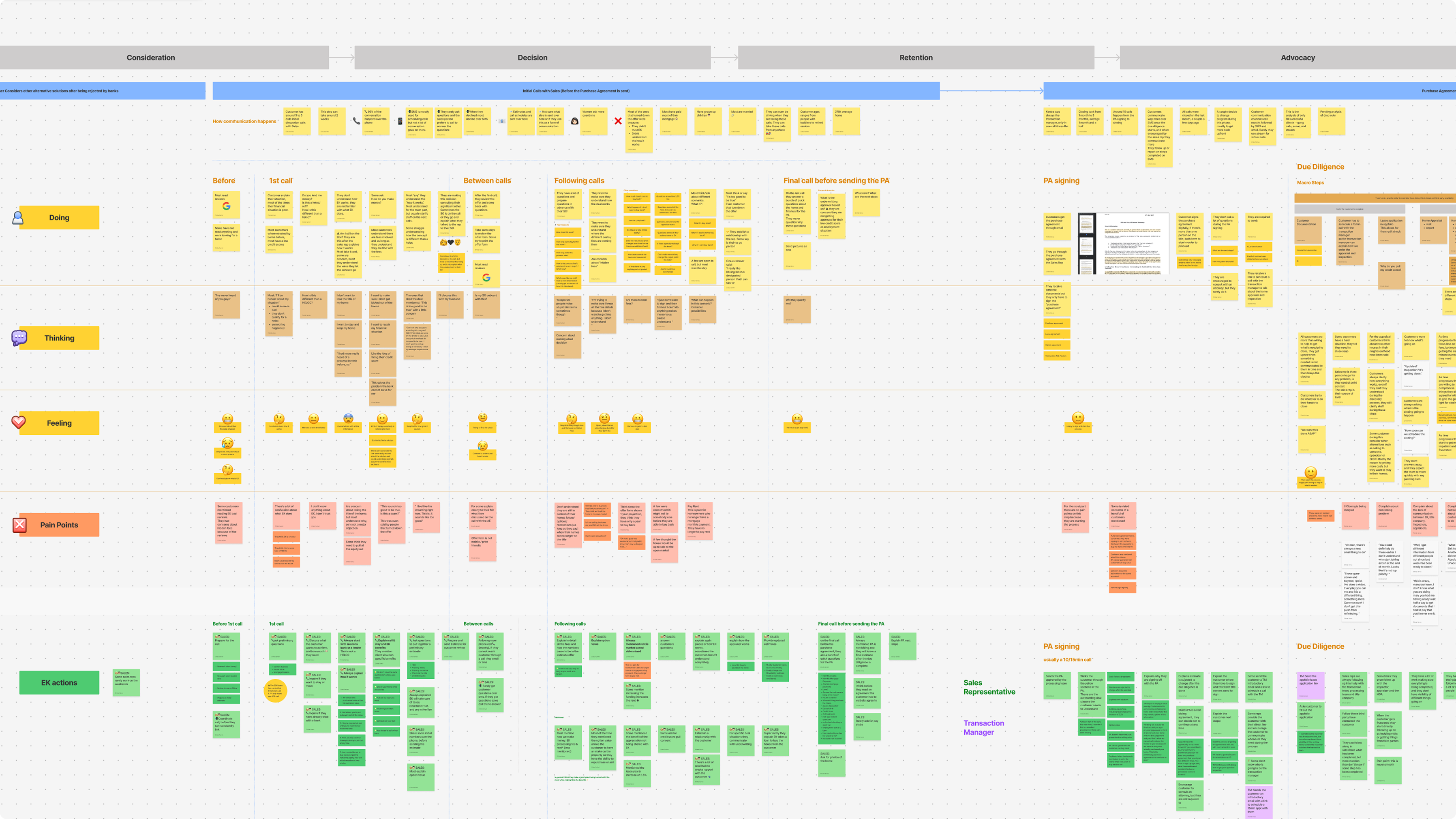
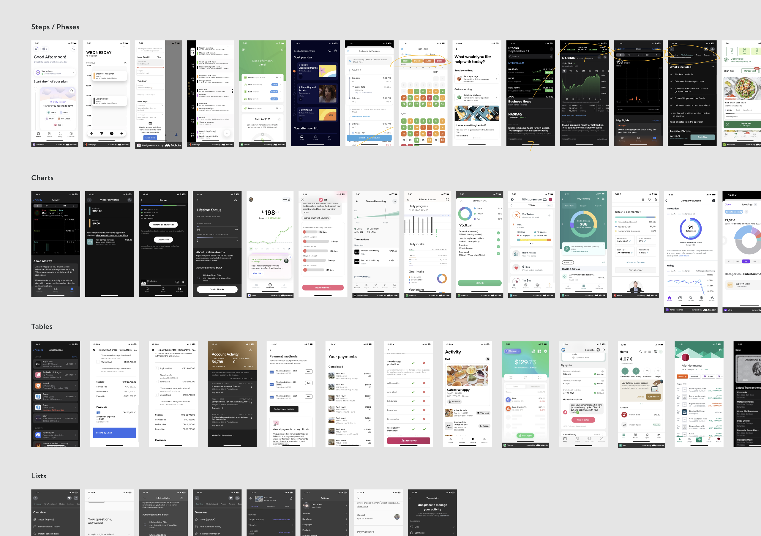
I researched competitor flows and best-in-class similar experiences to find patterns and inspiration for solving different sections.
We defined the initial project scope and long-term goals, considering not just user and business needs, but also tech and legal constraints.
We prioritized mobile-first design while also creating responsive layouts. I created quick prototypes and ran iterative reviews with stakeholders:
The project evolved over several iterations as the business changed.
Focused on visual refresh, copy updates and mobile adaptation to match new branding. This also gave engineers time to update backend logic. Also, the first iteration for the sales team wasn't radical.
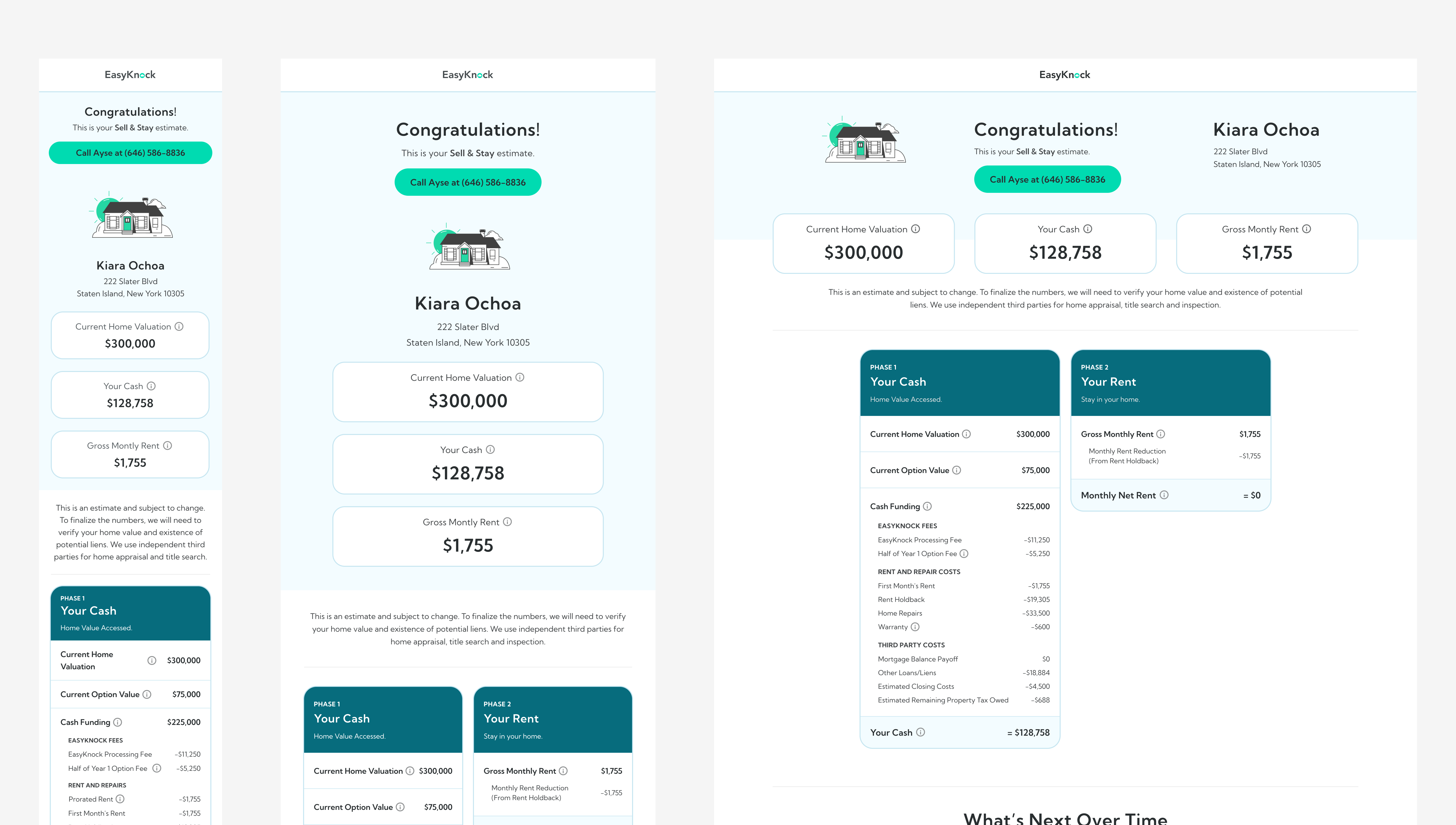
The second and main iteration addressed structure, legal language, A/B tests, and ongoing adjustments to business rules.
Added to build rapport. Included full contact info to help customers easily reach out.
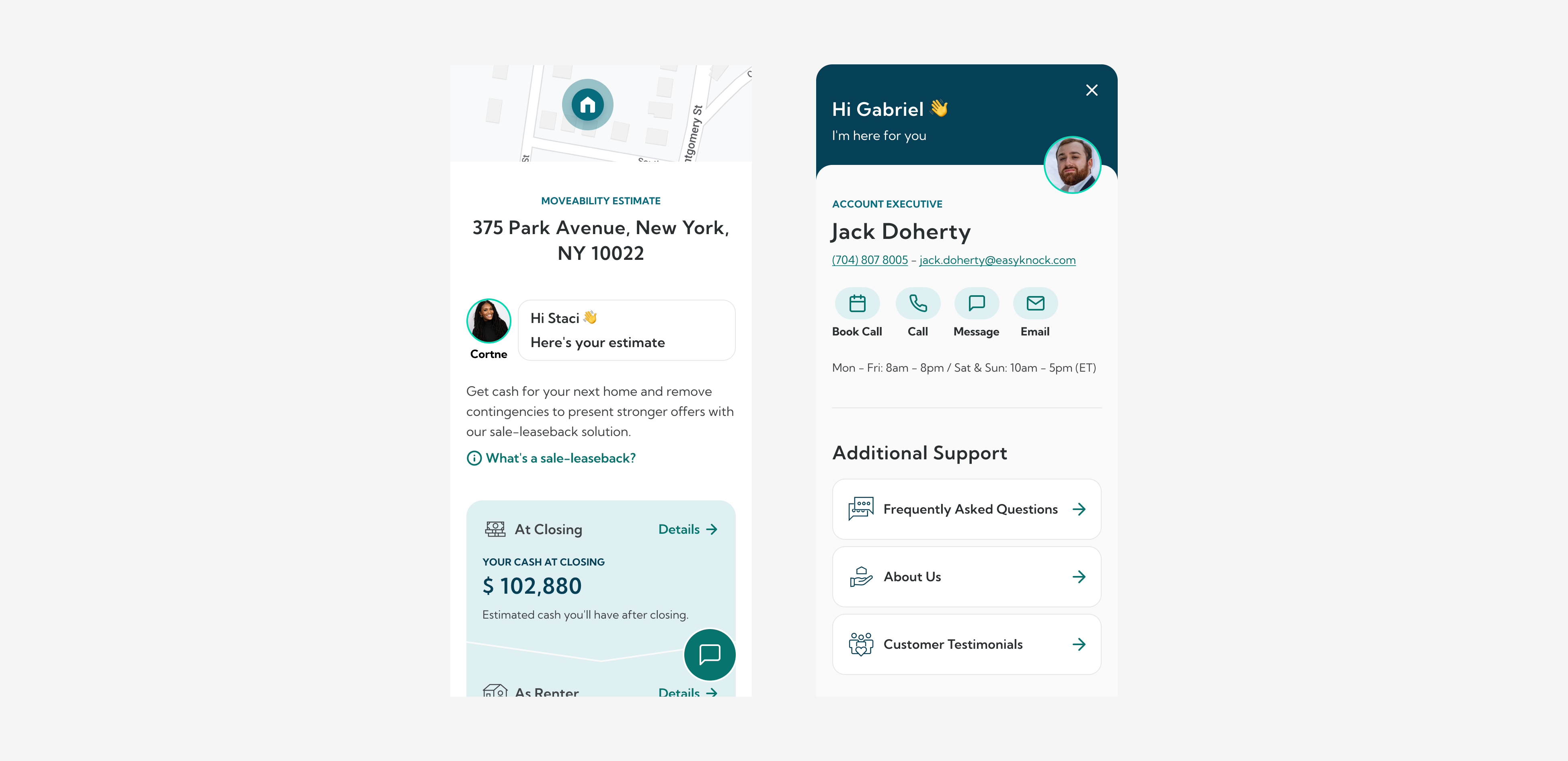
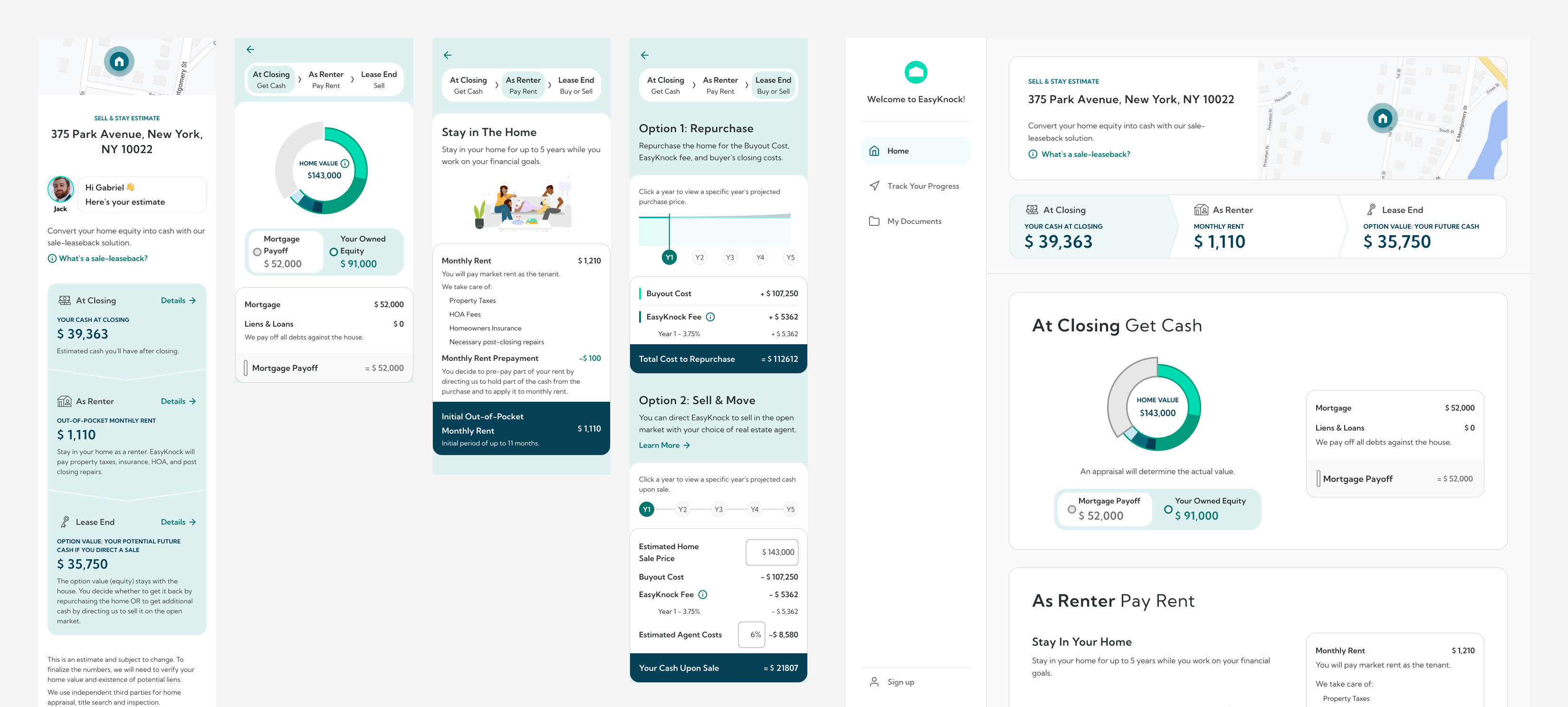
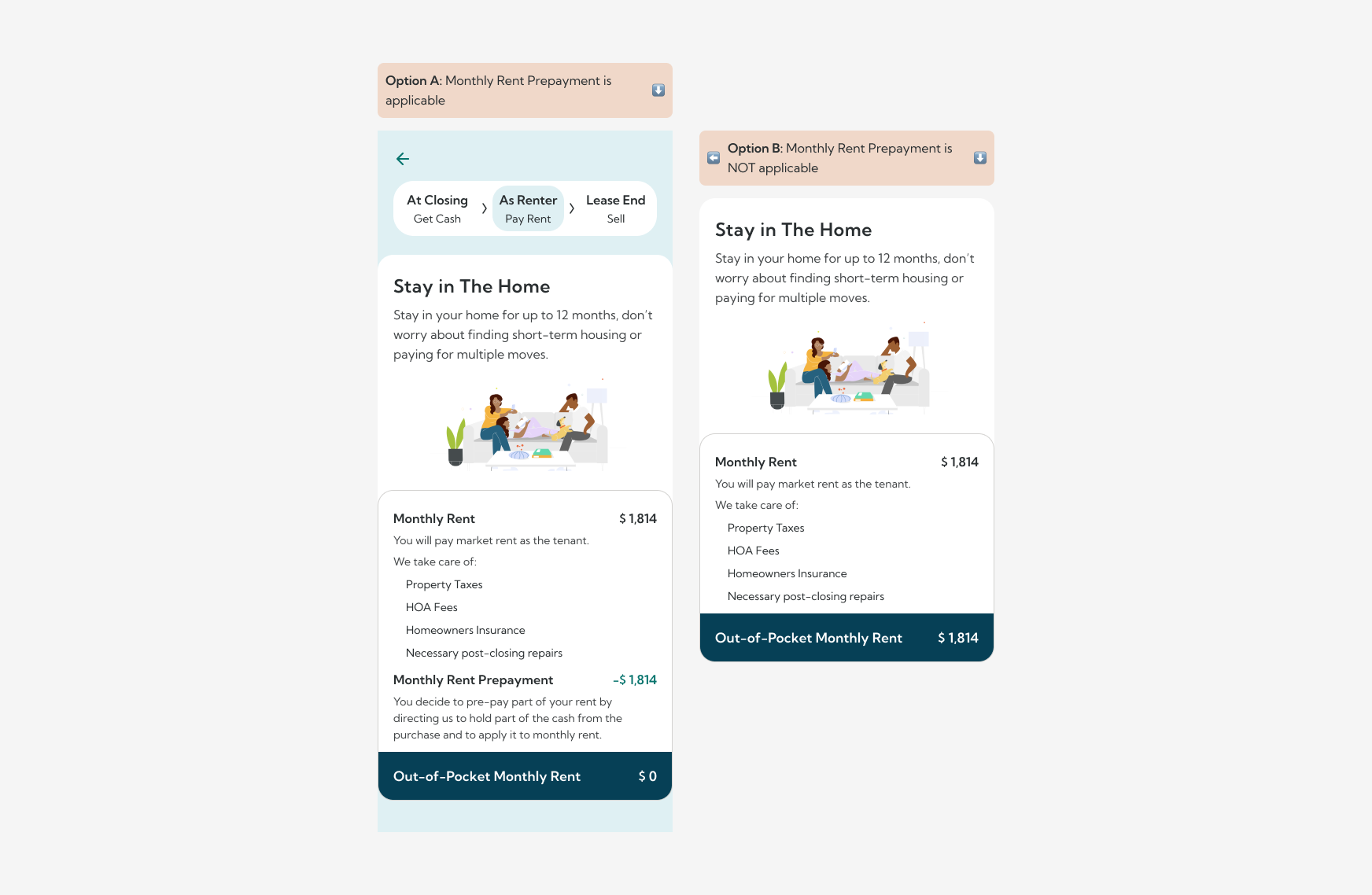
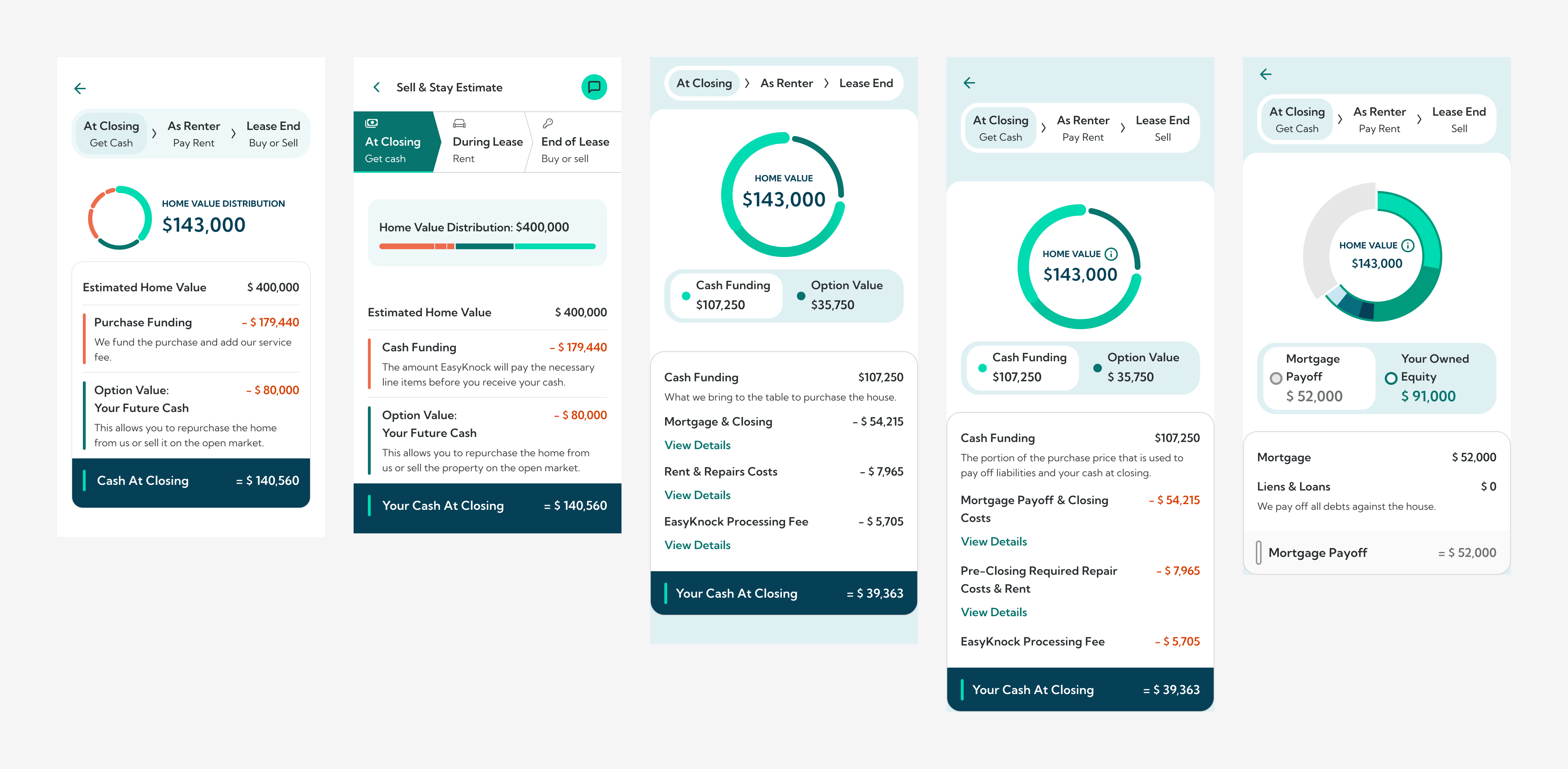
Financial info was split into three logical steps, at closing, as a renter and lease end. This made the experience easier to follow and helped structure sales calls. It solved several problems:
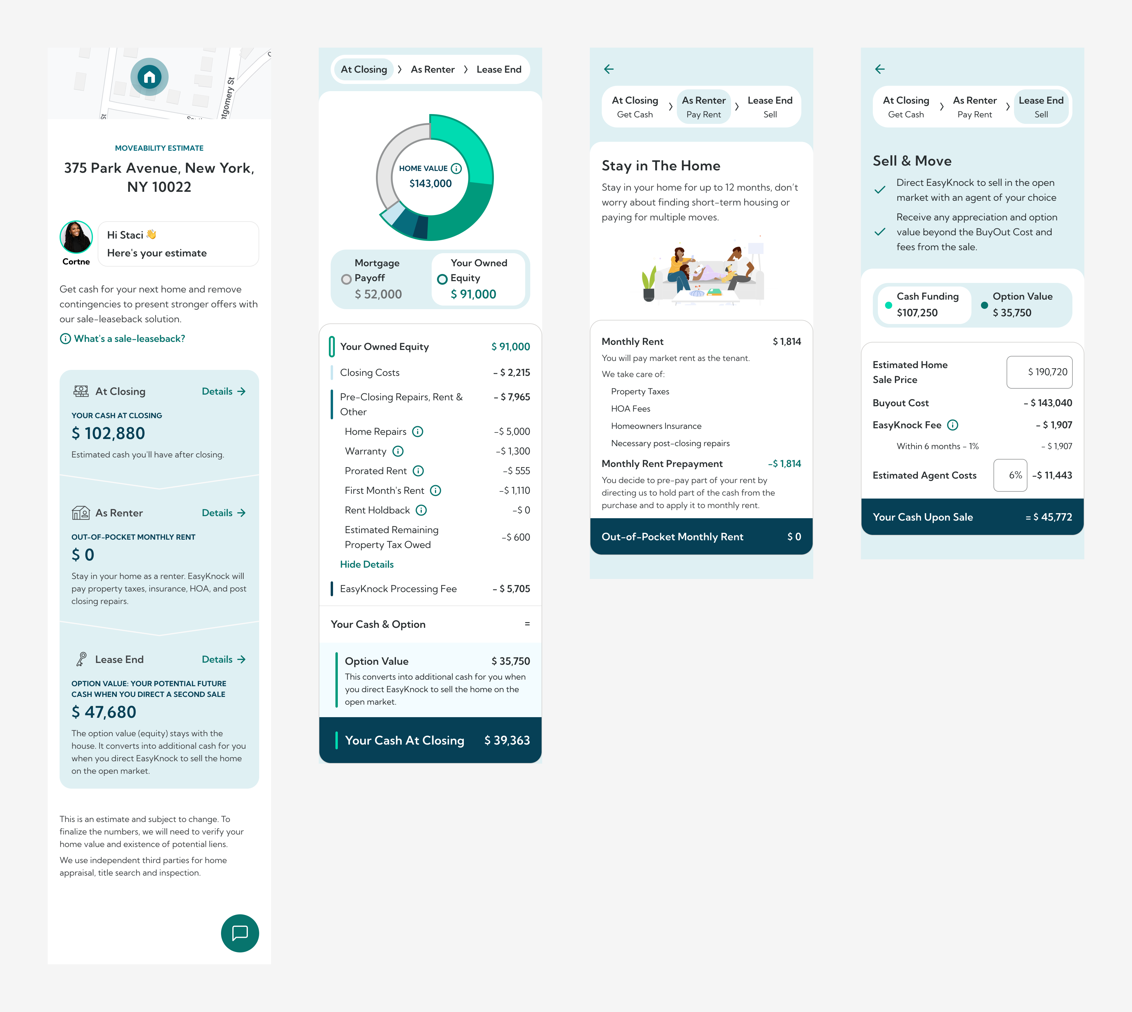
We added inline copy to explain key sections and tooltips for less common questions. This helped customers understand and also made it easier to share details with partners without needing extra calls.
Simple visuals made money breakdowns easier to understand. Users found plain numbers confusing or untrustworthy.
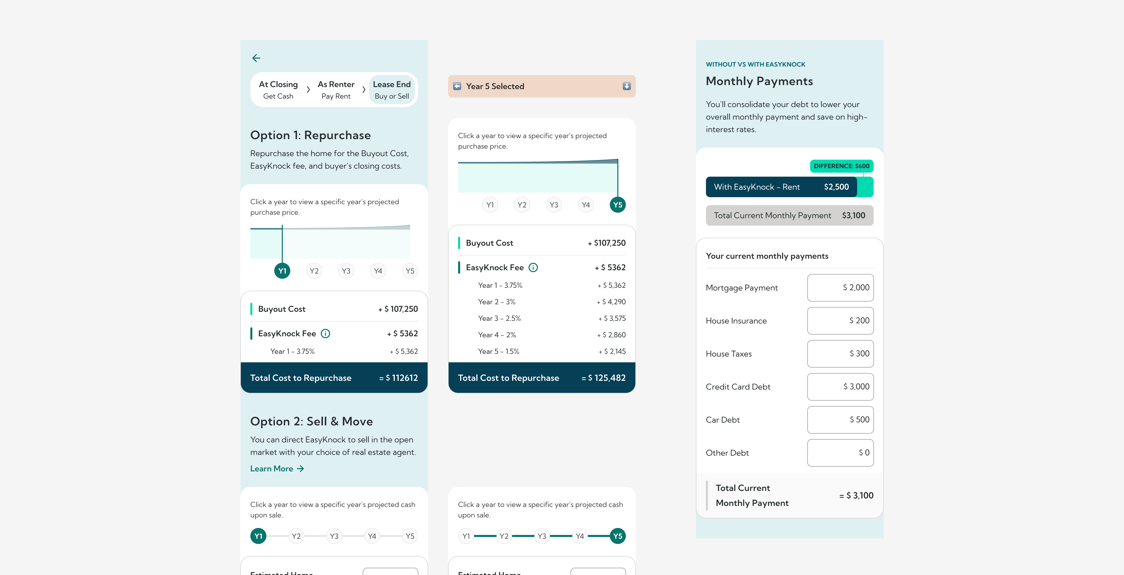
We kept the math but changed the framing. Instead of presenting how underwriting thought about the deal, we explained how using their home equity could help customers access cash.
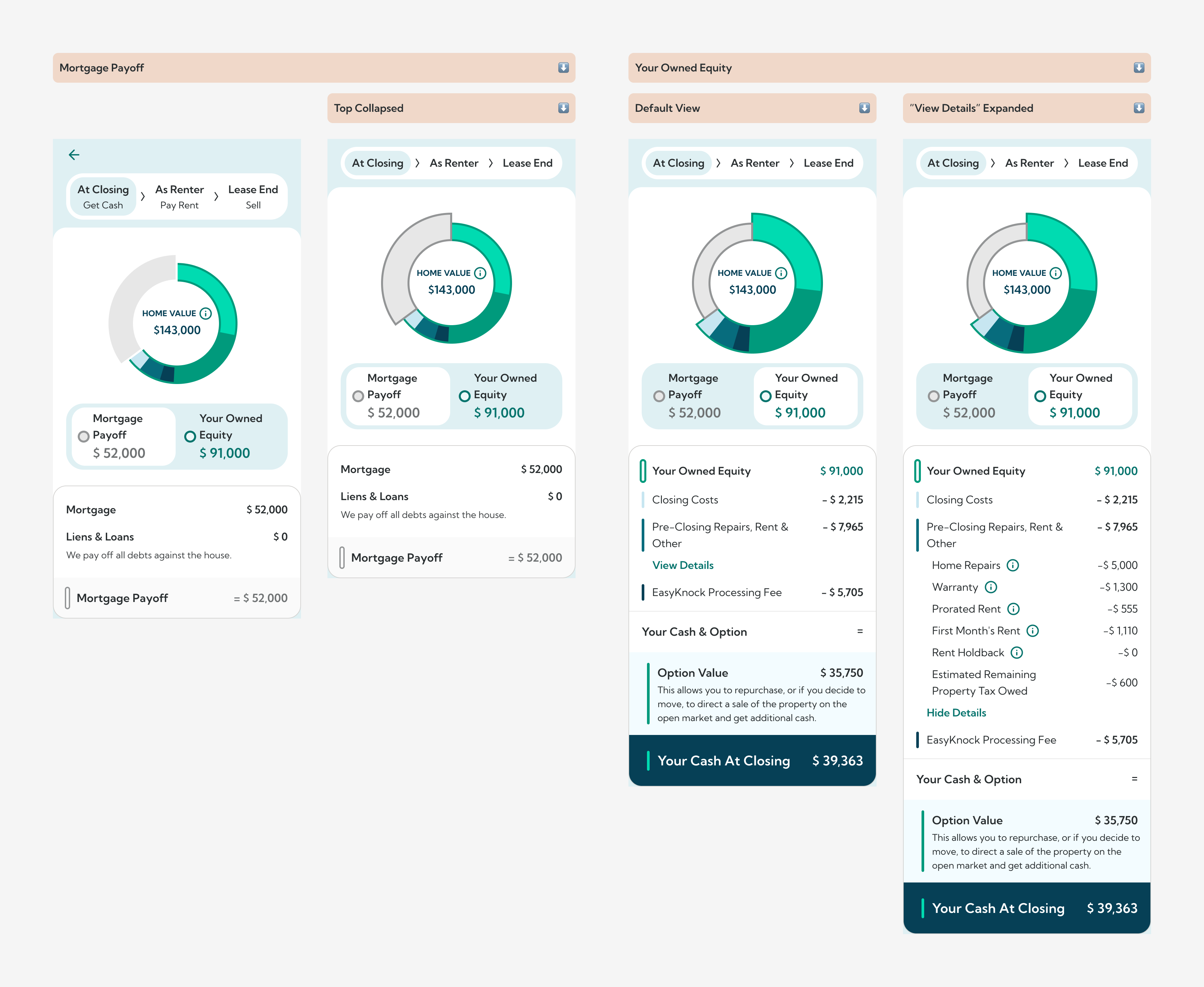
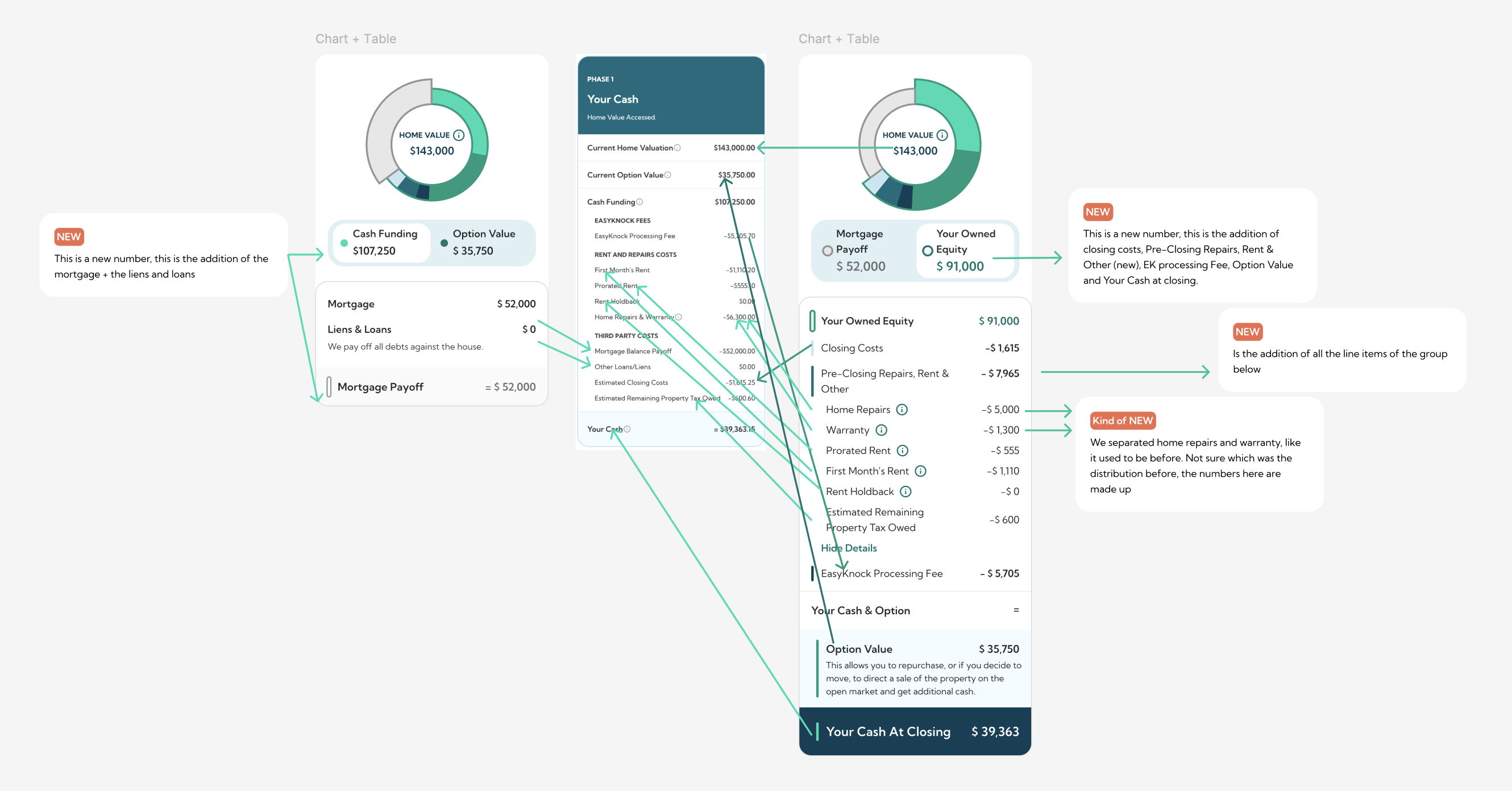
Used clearer, shorter language. We avoided jargon and aimed for more empathetic messaging. We made some compromises with the legal team, but still tried to simplify the language as much as possible within compliance limits.
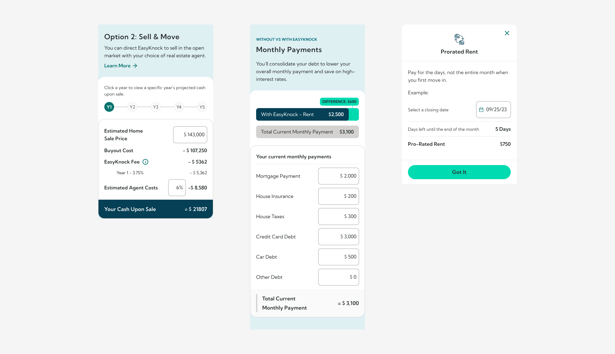
Added interactive tools so customers could explore different scenarios on their own instead of relying on sales to send multiple estimates.
We ran multiple rounds of testing using usertesting.com, focusing on specific areas of the estimate. We used feedback to iterate and test again. We also tested the final version with customers who had recently gone through the process. We A/B tested copy as well.
Despite frequent changes to fees, scripts, and policies, we worked to define metrics that could be reliably tracked.
Everything was documented in Figma, including notes, prototypes, and videos to explain interactions.
Average calls dropped from 3 to 2 before customers signed a purchase agreement, which was the next milestone in the sales funnel.
Estimate views went up, signaling stronger engagement (exact number not available).
More customers signed up for the portal after viewing the estimate.
Users navigated between different sections, showing the navigation was clear.
Involving stakeholders early helped build alignment, supporting decisions and made design approvals smoother for this and future projects.
Post-redesign interviews showed customers understood more, reported fewer questions, and trusted the product more thanks to the clearer visuals.
Shoot me a message at
