The portal was designed to support multiple products with similar but distinct flows. It needed to maintain consistency while remaining flexible enough to accommodate each variation.
Lack of transparency
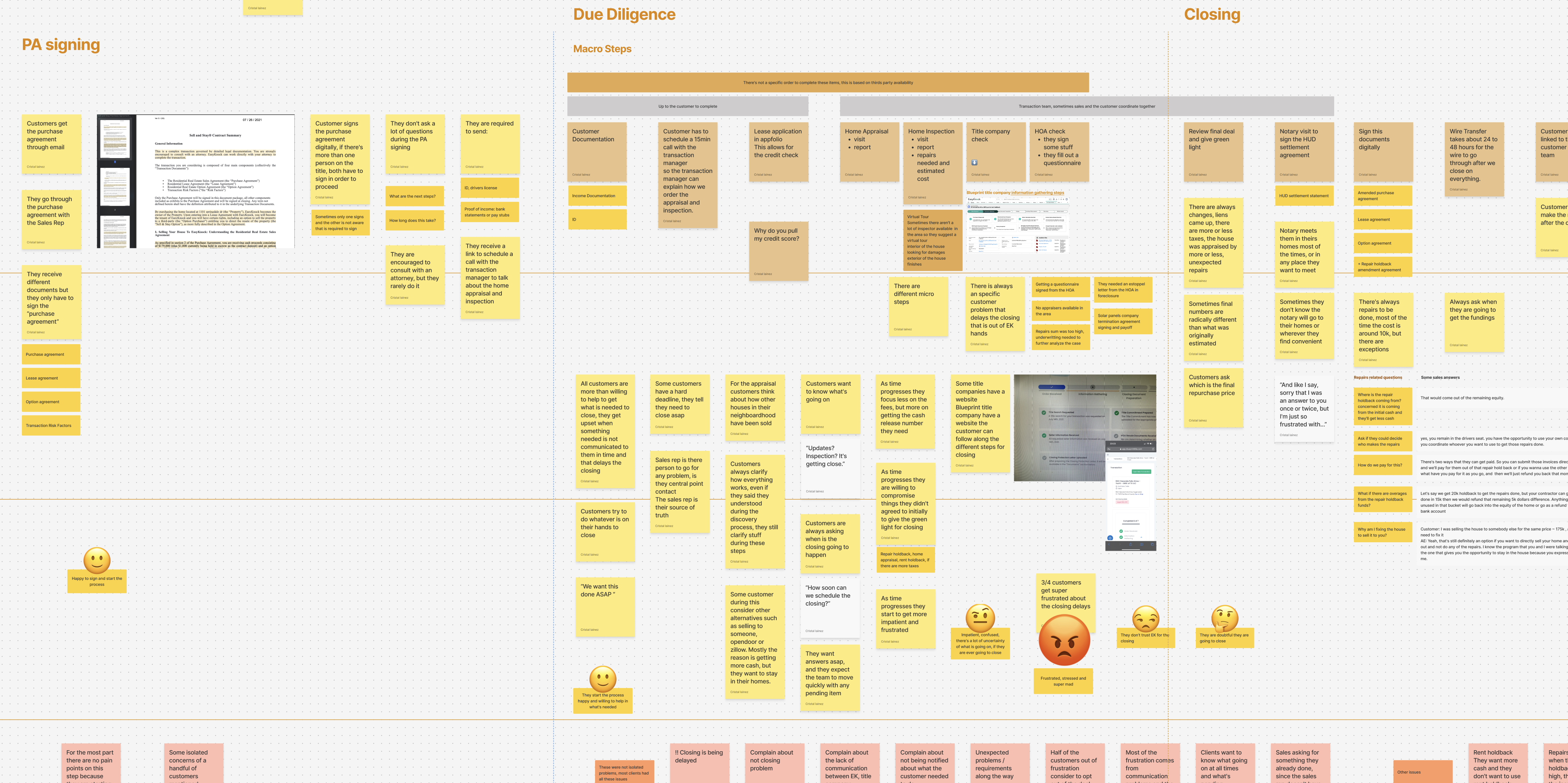
The 4–6 week process felt long and stressful to customers. Many felt left in the dark without clear updates on progress.
Communication breakdowns
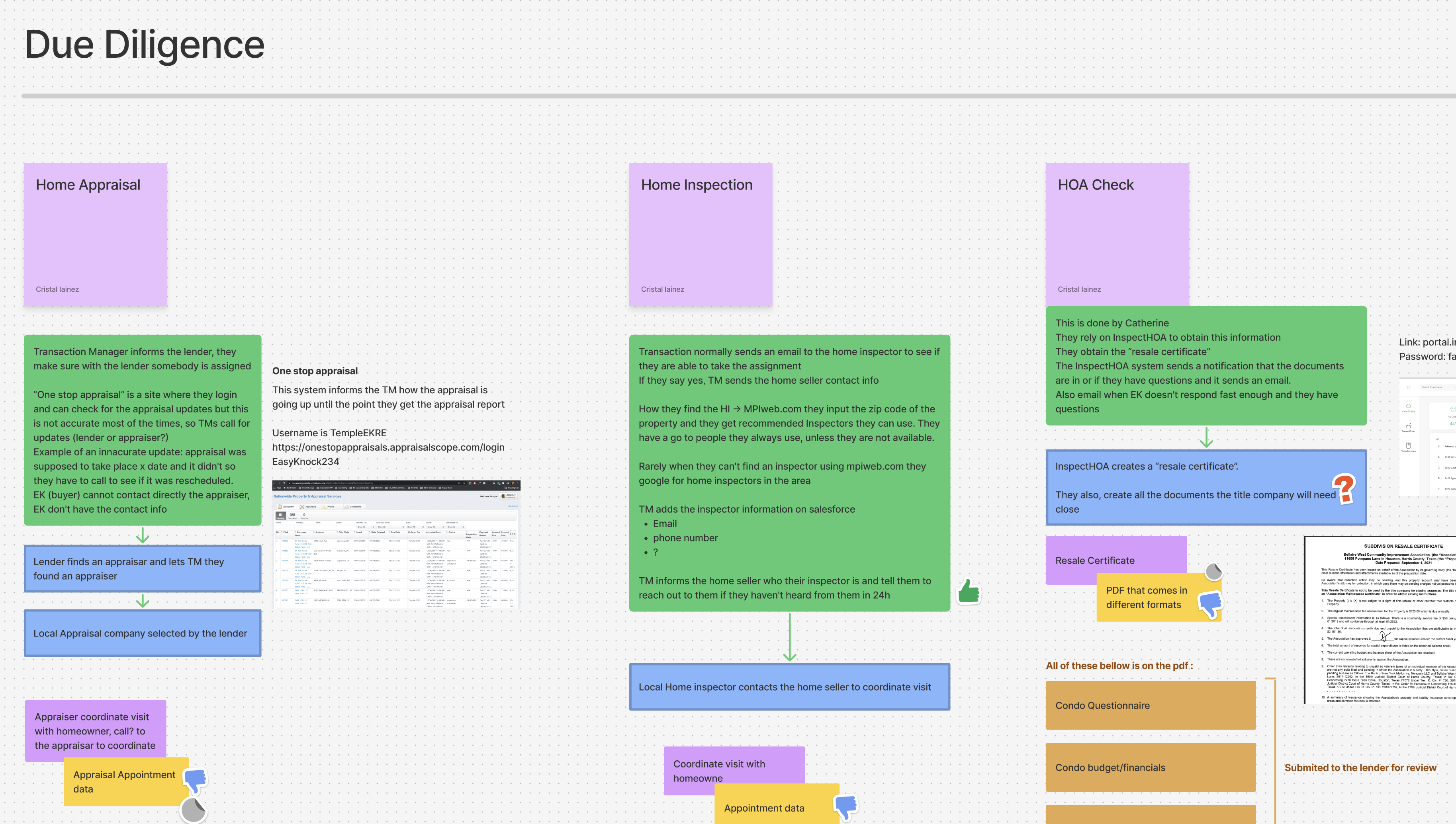
With multiple actors involved (sales, underwriting, inspectors, appraisers), communication was inconsistent and caused delays.
Inefficiencies
Several manual, repetitive steps created unnecessary work for internal teams.
Low financial literacy
Customers needed accessible, timely guidance to make informed financial decisions after closing.
Need for contextual education
Many steps involved sensitive or unfamiliar tasks. We needed to explain why each step was happening and help customers understand how to achieve the best possible outcome with the tools available.
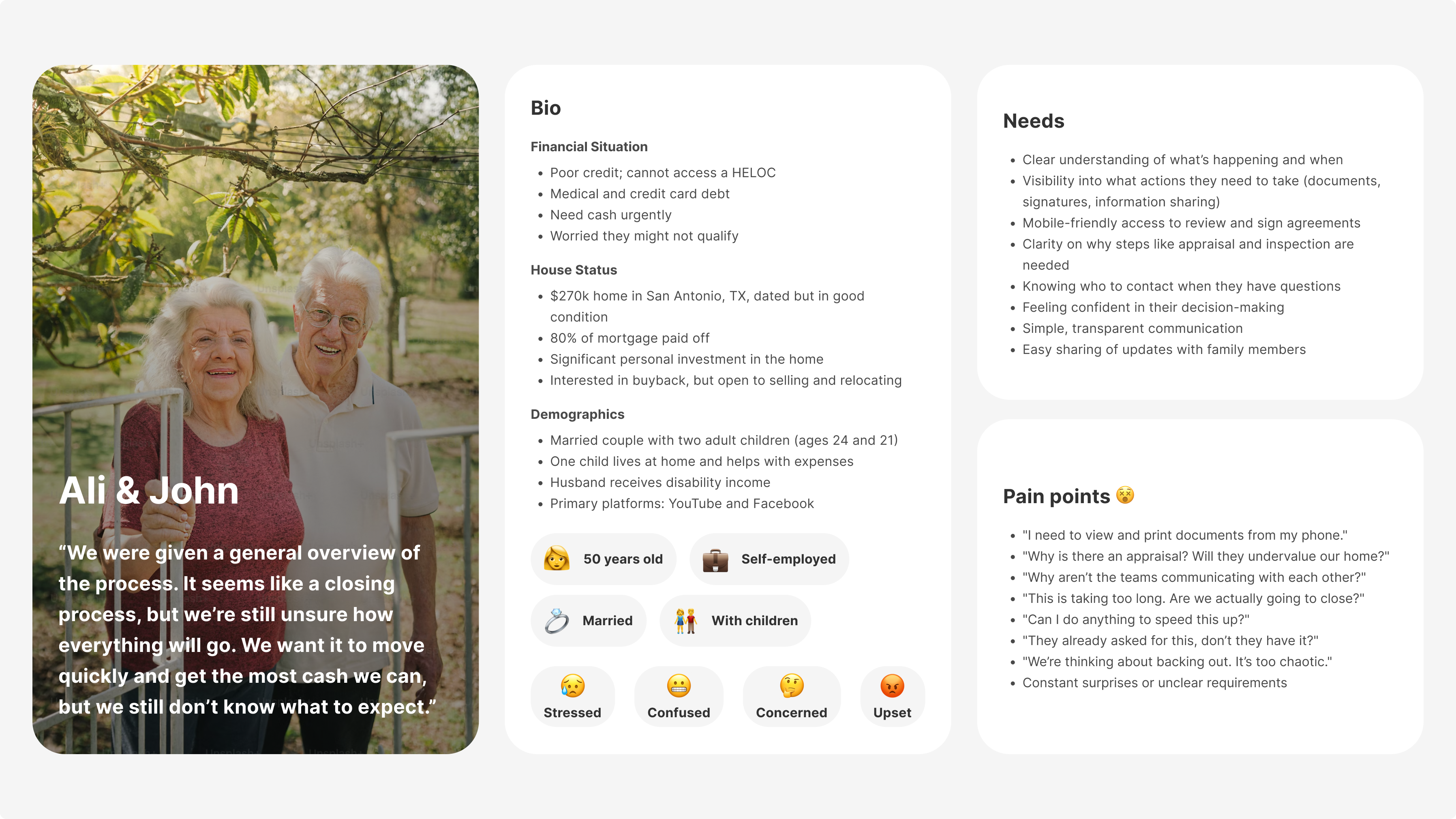
The typical customer was in a financially vulnerable position, often needing funds urgently. They were overwhelmed, uncertain about the process, and unsure whether they were making a sound financial decision. They lacked visibility and control.
I led UX design in partnership with the B2C product owner. The initiative was cross-functional, impacting different teams and internal tools. I aligned user needs with business priorities, collaborating closely across marketing, sales, transactions, underwriting, property management and engineering departments.
We analyzed the customer steps across different product lines to identify shared patterns and product-specific requirements.
Based on our research, and after mapping the activities of internal teams, third parties, platforms, and email-only communications, we created specific journeys for each product while identifying their common elements.
While there were few direct competitors, we looked at high-performing customer portals and applicable UX patterns.
Custom flows were defined for each product variant, maintaining structural coherence across the experience.
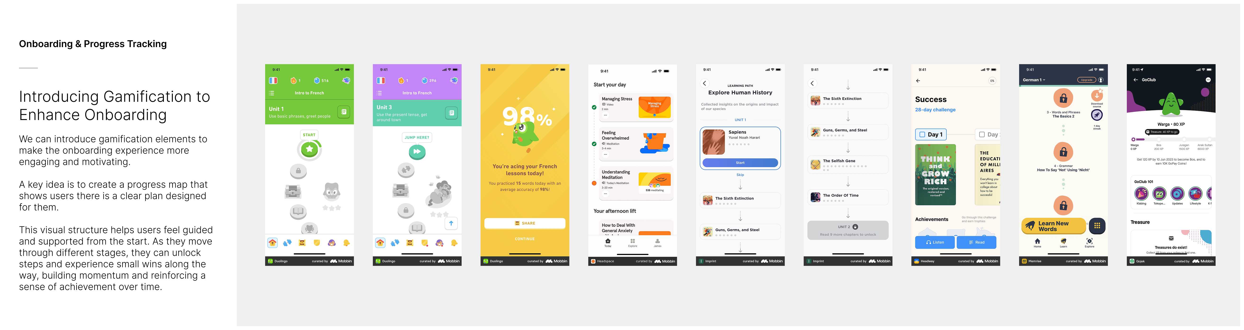
All features were designed upfront, with phased development planned. MVP focused on reducing uncertainty and automating repetitive internal tasks.
Mobile-first, with desktop support for more detailed actions. Core features included:
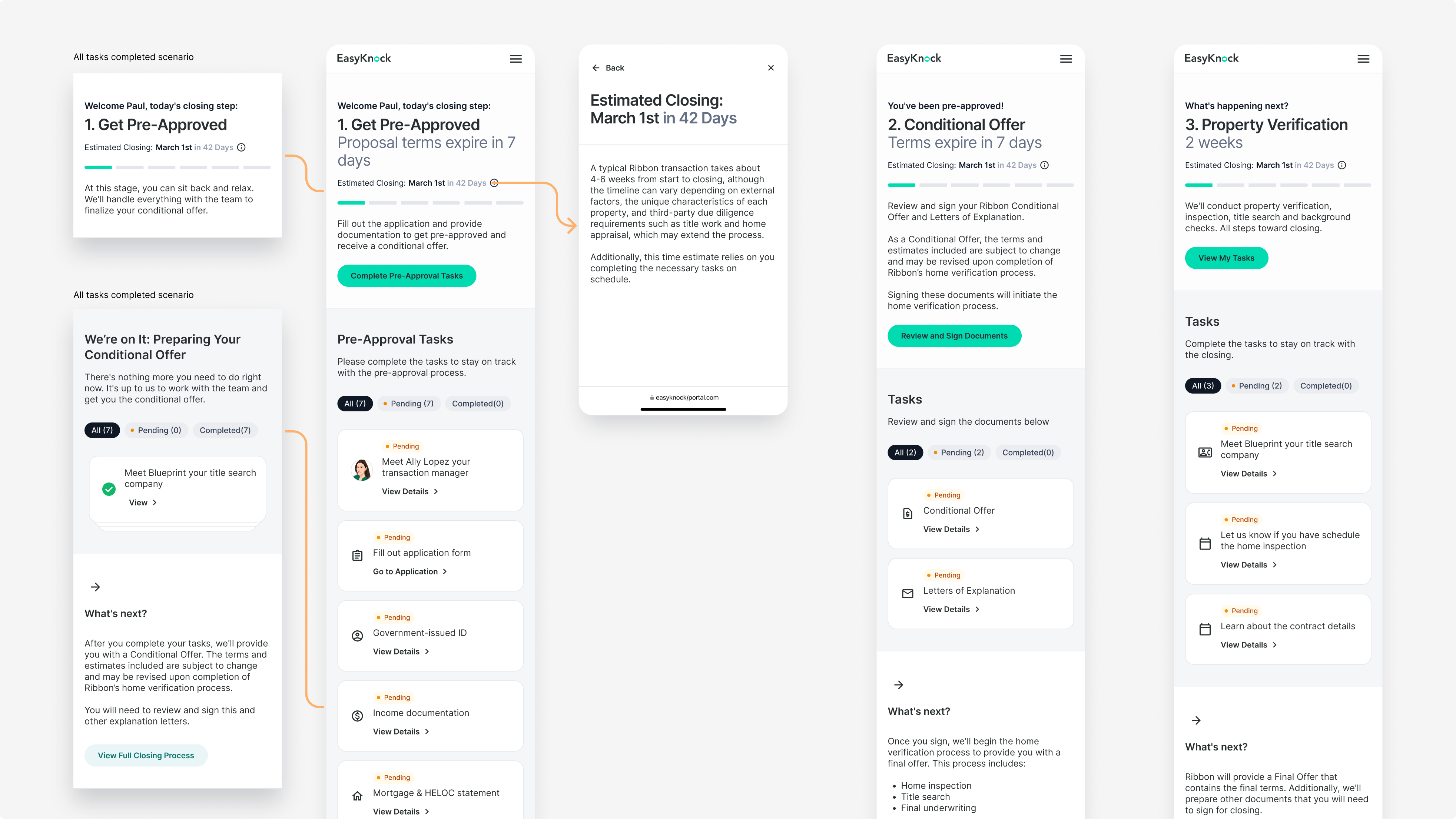
This feature clearly outlined the entire process, highlighting key tasks, expected timelines, and responsible parties to help set customer expectations. It was included at launch and quickly became the most visited page in the portal, essential for giving users a sense of clarity and control.
Highlighted the current step, how many steps were left, and the estimated timeline to closing—without overwhelming users with too much information. It also showed any tasks the customer needed to complete and summarized what to expect next. The copy adapted based on what they had already completed, and clearly indicated when no action was needed on their end.
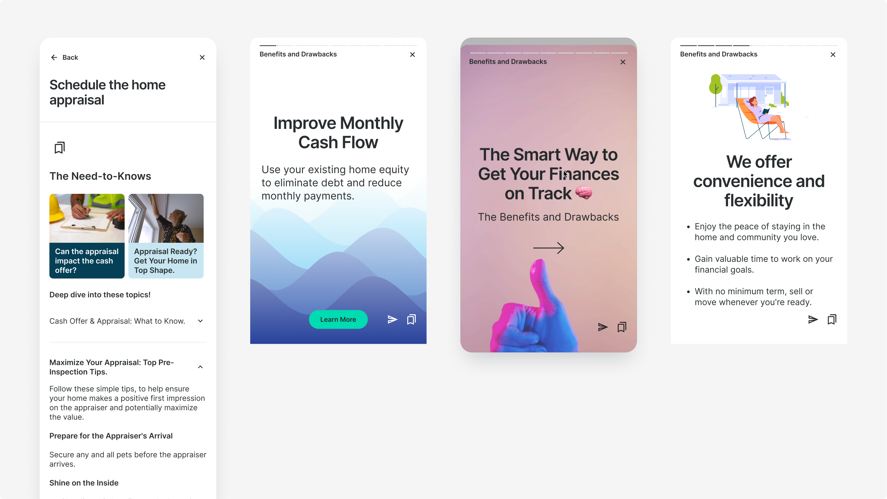
Every step or task included a custom educational section. Since our audience primarily used Facebook and enjoyed consuming content in video format, we adopted a short, story-like style inspired by social media. For users who preferred reading, we also included FAQs to provide the same information in written form.
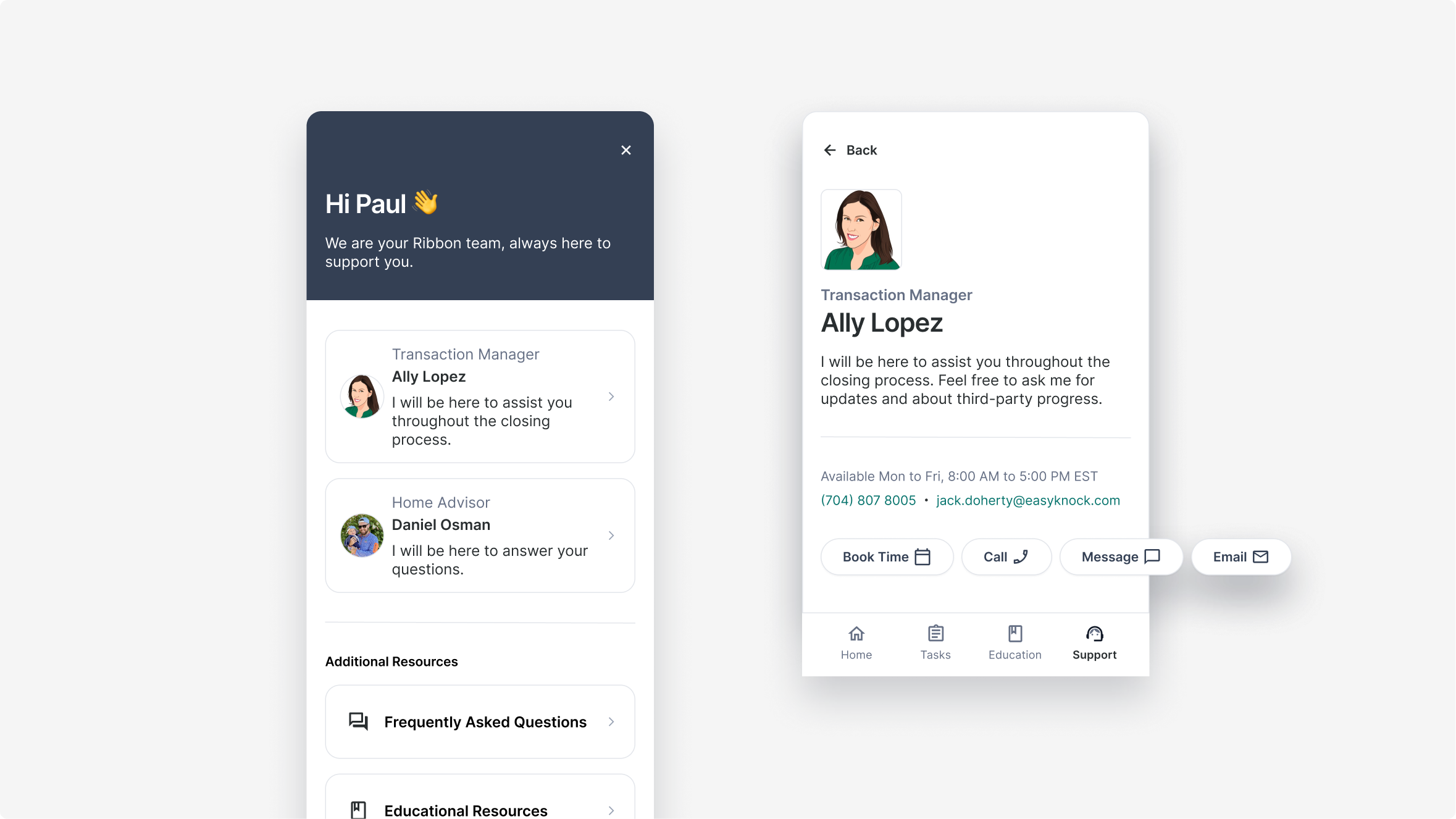
We focused on giving customers clear access to their team and contact details. This allowed them to understand who was supporting them and how to get in touch when needed.
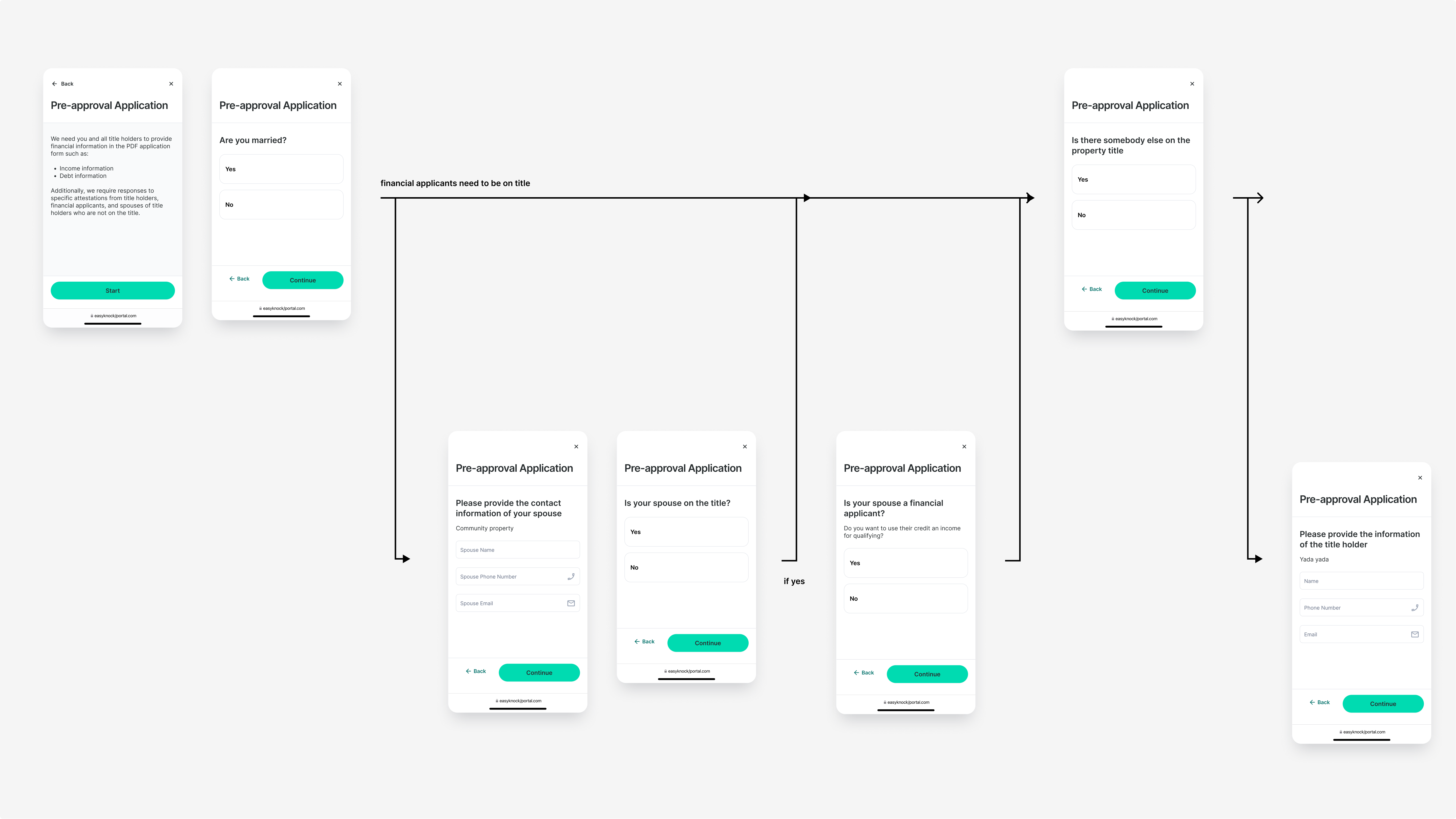
We created additional forms for data collection required by underwriting. These could be triggered from Salesforce based on specific use cases.
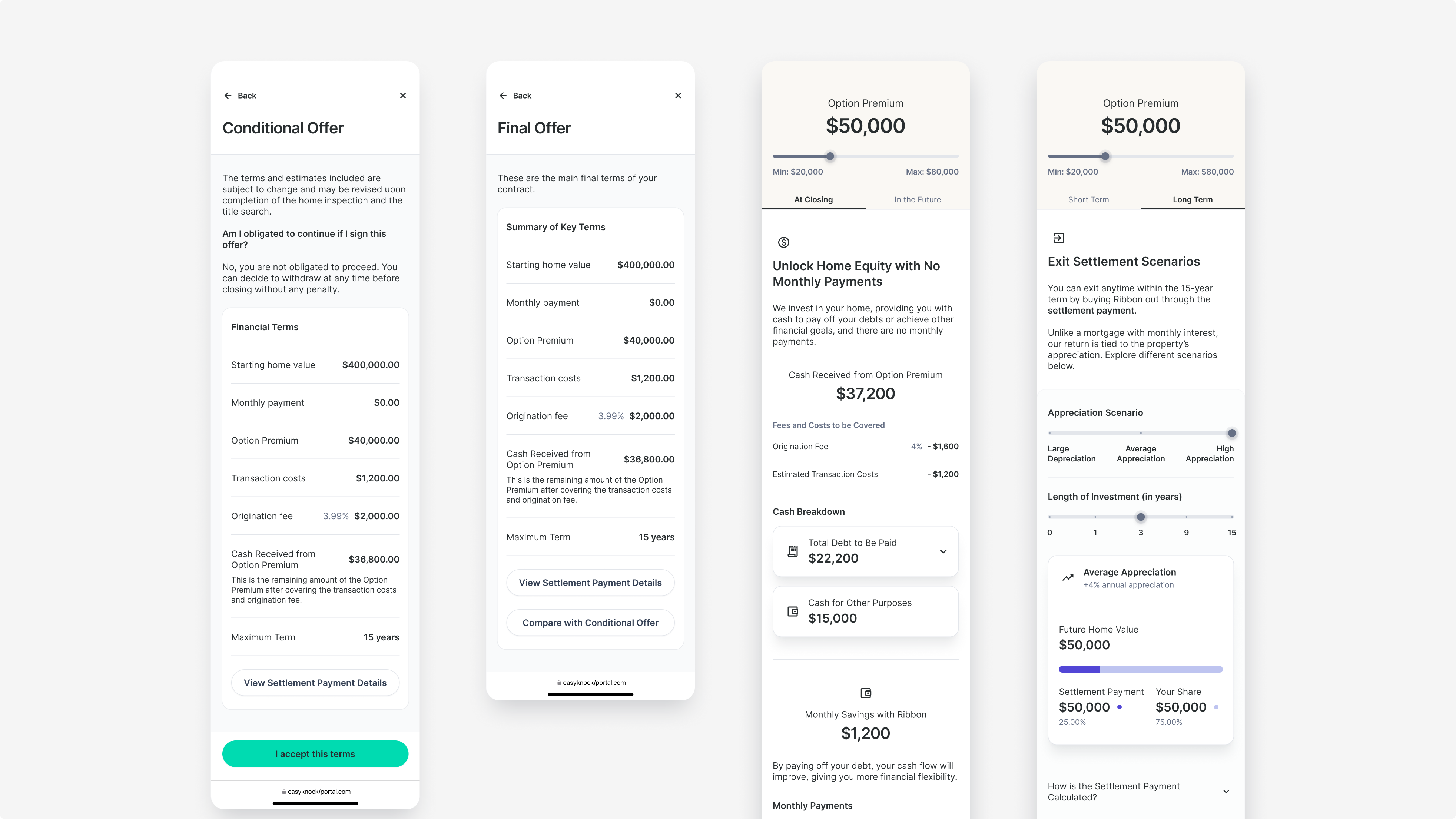
Summarized key financial terms from deal documents & enabled users to explore potential deal outcomes.
This project was complex on several fronts:
Shoot me a message at
